Use this pattern to introduce a landing page or site section. To apply it, set the page to the “No Title” template: using the right-hand Settings toolbar, on the Page tab, click the template title, choose “Change Template,” and select “No Title.” The heading will become the H1 and page title.
Use this to create a list of similar items that have a few sentences or more of paragraph text that needs to line up with a corresponding image for each — such as a list of buildings or labs with their photos.
It’s especially good for one-off lists of people who aren’t in the directory, like award recipients or board members with their headshots.
Use instead of layout tables
This is a better method of stacking similar items than putting them into a table, which can cause problems when content is viewed on a mobile device, as well as accessibility problems for people who use keyboard navigation and screen readers. Tables should be reserved for tabular data rather than for layout purposes alone, and this component will handle the responsive design more effectively while also keeping the images aligned with text headings across different screen sizes.
Accordion
Use accordions when you want to do any of the following on a web page.
Accordions are especially good for when you need to convey some details to a particular audience that don’t apply to the majority of your page vistors. They can be a good way to convey things like visa instructions for international students on a general admissions page, which domestic students don’t need to know about.
Accordions can be great for users who are looking for what they assume is a specific detail that doesn’t apply to everyone, like special instructions for transfer students on a page meant for more general student audiences.
Frequently asked questions can be good for pointing out ancillary details or tailoring the page content to specific audiences, situations, or contexts. They can also be good for SEO and AI optimization, especially if the page structure prevents that content from being displayed more directly in the main content area. BUT make sure to check back often to make sure the content in them is up-to-date; conflicting or incorrect information can be worse for SEO/AIO than having none at all, as well as bad for usability.
Descriptive headings help users target which panels will help them answer their question or complete their task. They should be able to understand what’s under each panel without having to click open to read.
If the content within an accordion is relevant to all page visitors, it’s best to display it directly on the page using headings and paragraphs rather than tucking it underneath an interactive panel that requires them to click to see it. Assume users might miss anything you put in the panels and keep them for supplemental information only.
Use the Billboard pattern to break up a page layout for an important call to action. The fewer links you include, the better they will perform. Use dark background options at the bottom of the page, so it doesn’t create a “false footer effect” that causes users stop scrolling because think they’ve reached the end.
Conveying all the component parts of a topic, like program requirements, concentrations, or the available options within a major
Collecting items or examples around a similar topic, like a list of potential career paths that links out to related career outcomes data
Listing out benefits, features, or other supporting details that will help a user decide whether the link will be relevant to them
Showing the steps in a process
Tip: Just make sure everything in this box is about the same topic; don’t use it just to get a 2-column layout. The background box will make users assume it’s about a single thing, causing them to miss some of your information.
Overlapping feature
One of several “feature” choices, use this to call attention to, promote, educate about, or route users to information. Image and text should support each other, and button text should describe what it links to (not just say “learn more”). To flip content left/right, select the Media & Text container in the lefthand List View toolbar and choose the corresponding icon from the popup menu.
One of several “feature” choices, use this to call attention to, promote, educate about, or route users to information. Image and text should support each other, and button text should describe what it links to (not just say “learn more”). To flip content left/right, select the Media & Text container in the lefthand List View toolbar and choose the corresponding icon from the popup menu.
One of several “feature” pattern choices, use this to showcase videos of people sharing their first-person perspectives on a topic. Link text should be descriptive (not just “learn more”).
“I didn’t expect to work with real clients this soon.”
Cora ’26, Design
“I didn’t expect to work with real clients this soon.”
Cora ’26, Design
Fancy Feature
One of several “feature” choices, use this to call attention to, promote, educate about, or route users to information. Image and text should support each other, and button text should describe what it links to (not just say “learn more”). To change the media to video or multiple images, select the Fancy Feature container in the lefthand List View toolbar and choose the Media Type from the Block menu in the righthand toolbar.
Masonry Gallery
Optional Subhead
Add and arrange images to show things like multiple parts of an experience, atmospheric details, and other things words alone can’t convey. Try to vary aspect ratios, wide vs. close-up shots, and subjects between images to tell a diverse and more complete story. Use toward the bottom of pages in case users assume the rest is just photos and stop scrolling.
Use this to communicate an impending deadline, process change, or other unexpected message. Aim for 30 words or fewer, and provide a link to more info. Use only one at a time.
Use this to deliver sets of links that are divided into clear groupings (assume users might only read the headings and skip the links, so make sure they’re grouped logically). Can be used with or without images, but keep it consistent between columns.
Use this pattern to provide up to 25 words of explanation each about similar link options, to give users enough context to make a choice before they click.
Make sure text length is similar for each item so that columns roughly align, and keep in mind columns will stack instead of displaying side-by-side on small screens.
Page titlewith italics
Use this pattern to introduce a landing page or site section. To apply it, set the page to the “No Title” template: using the right-hand Settings toolbar, on the Page tab, click the template title, choose “Change Template,” and select “No Title.” The heading will become the H1 and page title.
Use a Secondary Navigation pattern directly after your page header for most pages on the site, so users can browse, navigate, and orient successfully. The menu will automatically populate once the page is published based on page parent relationships you set in the page settings panel at right. This gives the user a true picture of where this page “lives” in the site tree in relation to other pages in its section.
You can choose to add full-width patterns after the menu ends, but that this can introduce either trapped white space when the content beside the menu is shorter than the menu itself. It’s better to keep the page narrow and have white space below a sidebar menu than to have too-short content that causes a user to miss what’s below. Keep in mind that the content will adjust its height dynamically to fit different screen widths, and that the menu height will change when future pages are added/subtracted from the site section.
Optional wysiwyg text. Maecenas varius massa vestibulum porta cursus maecenas. Lectus mattis lectus nunc tellus mauris. A interdum ipsum risus lobortis suscipit imperdiet.
Use for displaying tabular data, not just as a shortcut for layout. If your content isn’t comparative and doesn’t really need a table, you can use the stacked list pattern or column blocks instead.
Caption. Lorem ipsum dolor sit amet, consectetur adipiscing elit. Integer scelerisque malesuada ex. Nulla commodo augue non commodo scelerisque. Class aptent taciti sociosqu ad litora torquent per conubia nostra, per inceptos himenaeos. ** Interdum et malesuada fames ac ante ipsum primis in faucibus. Sed elementum, erat ac scelerisque pellentesque, lectus magna ullamcorper augue, vitae aliquet arcu tellus accumsan ipsum. Orci varius natoque penatibus et magnis dis parturient montes, nascetur ridiculus mus.
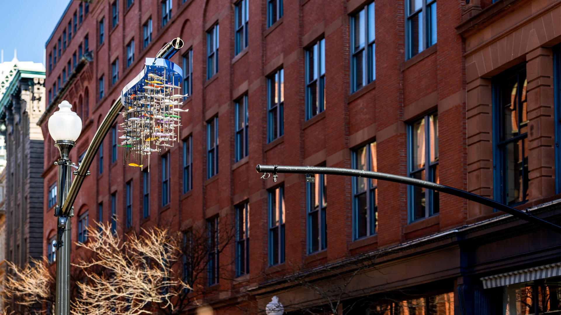
A JWU professor and alumnus turned their mentor-student relationship into a public art collaboration, creating a sculpture that now brightens downtown Providence.
A JWU professor and alumnus turned their mentor-student relationship into a public art collaboration, creating a sculpture that now brightens downtown Providence.
A JWU professor and alumnus turned their mentor-student relationship into a public art collaboration, creating a sculpture that now brightens downtown Providence.
A JWU professor and alumnus turned their mentor-student relationship into a public art collaboration, creating a sculpture that now brightens downtown Providence.
A JWU professor and alumnus turned their mentor-student relationship into a public art collaboration, creating a sculpture that now brightens downtown Providence.
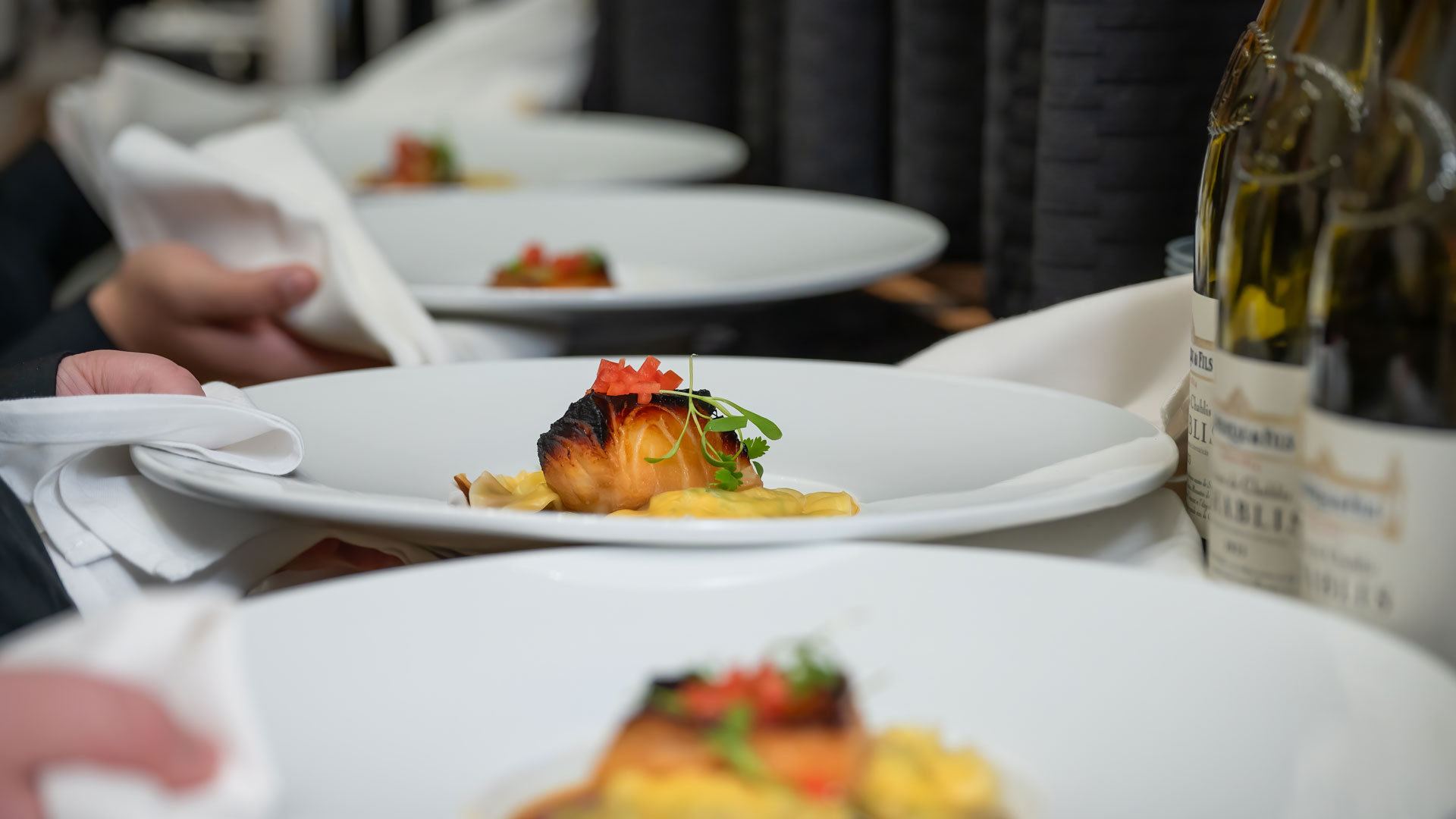
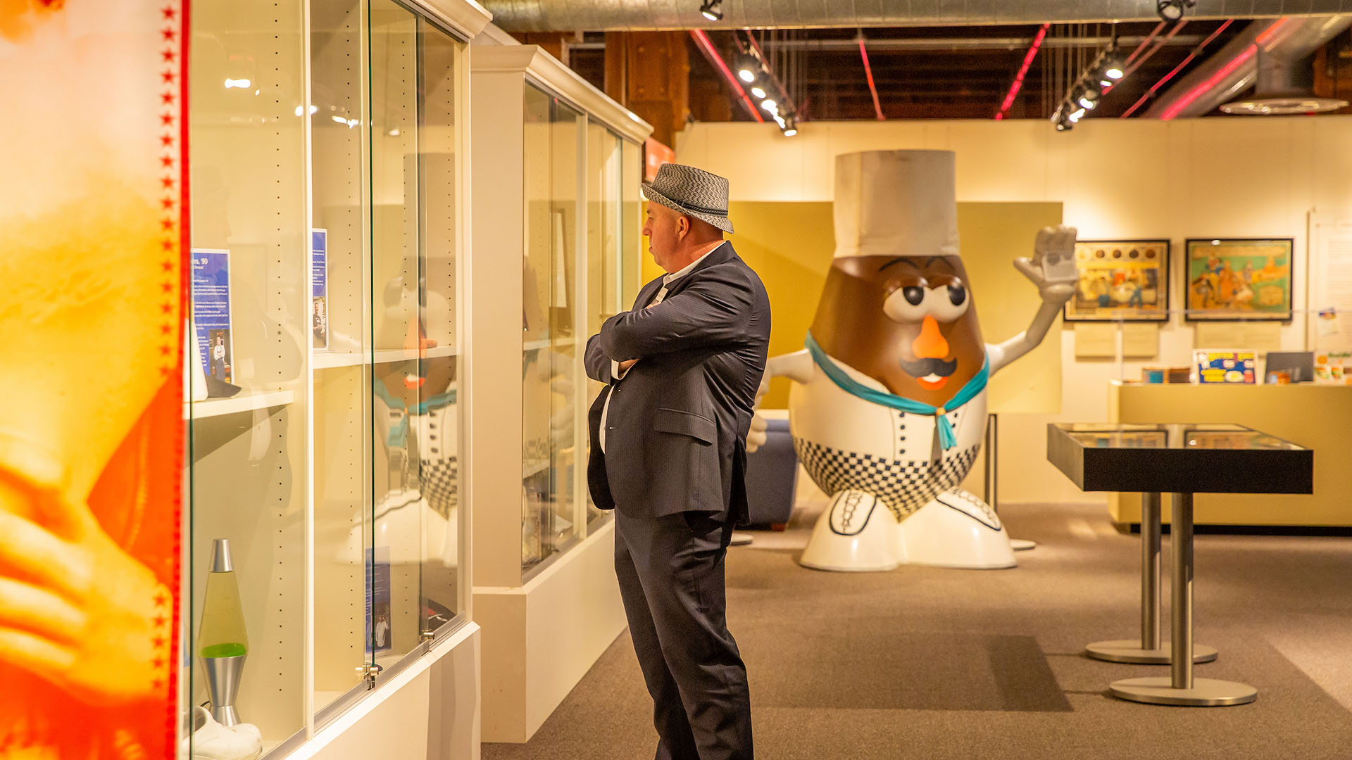
At the Johnson & Wales Providence Campus, there is a hidden gem few outside of our community may know exist: the Culinary Arts Museum. Home to a vast collection of artifacts, ranging from historic menus to rare cookbooks, the museum serves primarily as a teaching space for students. But this fall, the doors will open…
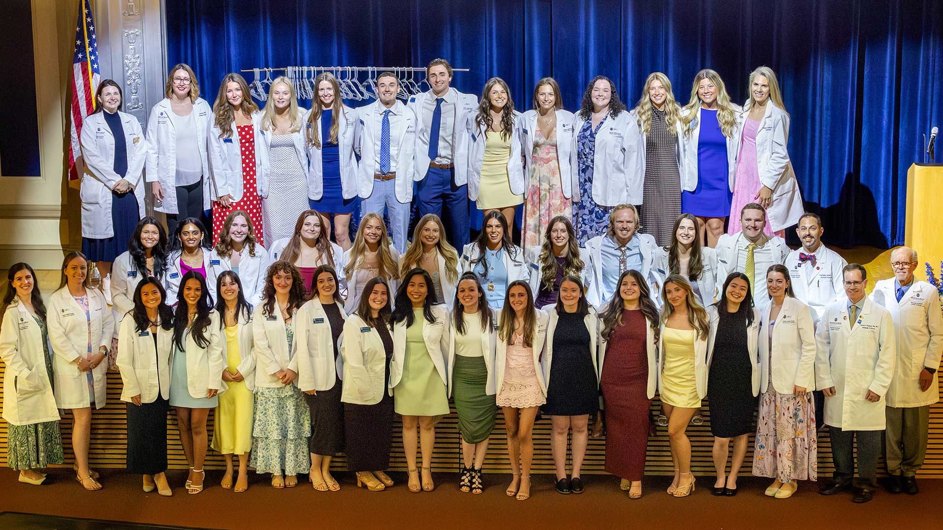
In June 2026, Johnson & Wales University celebrated a milestone for its Master of Science in Physician Assistant Studies (MSPAS) Class of 2027: completing classroom study and entering a year on hands-on clinical fieldwork. Here’s what that means and why the White Coat Ceremony is important for healthcare practitioners.
From addiction recovery centers to parole supervision offices, JWU Psychology students gain hands-on experience in diverse real-world settings. This spring, Parker Zapata ’27 added to that tradition through an internship at Mosaic Pediatric Therapy, a center that specializes in applied behavior analysis (ABA) therapy for children with autism
Two JWU Design students are bring creativity to the RISD Guild, working to create interactive museum experiences that connect art, design and community
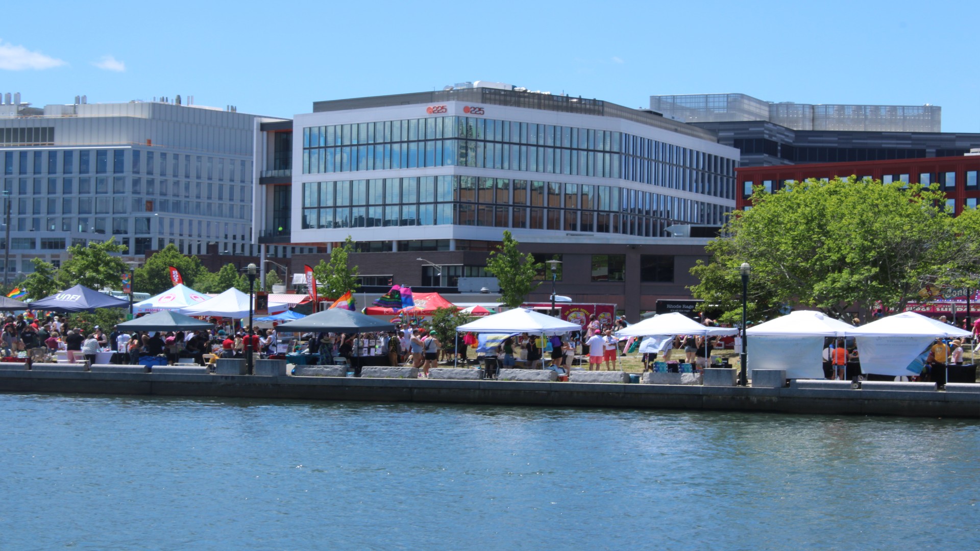
The revamped Larry Friedman Center for Entrepreneurship, simply known as the eCenter, is the hub for entrepreneurial activity at JWU Providence. Under the guidance of Jeff Binczyk, the eCenter brings together entrepreneurial studies, experiential opportunities, mentors, and small business support services to transform students into entrepreneurs and their ideas into commercial or social enterprises.FIT Symposium 2024. photo: Scott Bowers 2024
A JWU professor and alumnus turned their mentor-student relationship into a public art collaboration, creating a sculpture that now brightens downtown Providence.
A JWU professor and alumnus turned their mentor-student relationship into a public art collaboration, creating a sculpture that now brightens downtown Providence.
“College is an experience you don’t ever get to experience again – a once-in-a-lifetime opportunity to find out who you are vs. who you thought you were.”
“Quotes are great for showing social proof that supports a message or conveys a feeling you can’t explain in regular text. Aim for 35 words or fewer to stay readable on all screen sizes.”